2018
e-commerce
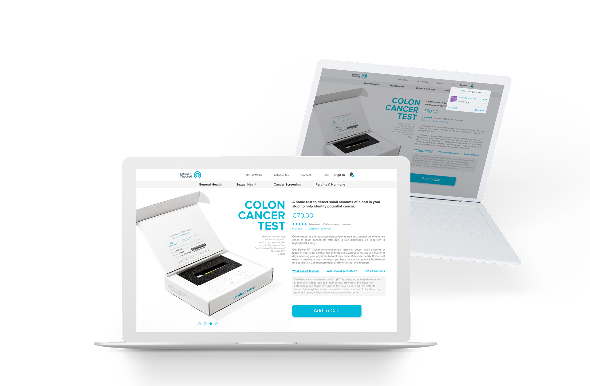
SCREEN MOCKUP (ref)
My first impression is that is a lot going on on this screen, and I tried to remove all the extra noise (including a small redesign of the nav bar, without the small resizing).
I gave more focus on the product, keeping it bigger and removing the thumbnails of the other pictures. The idea is to have it sliding to change products and you can zoom in just hovering the image.
More focus on the action button could help driving sales, as we have a clear action to perform on this screen. I did an example of what should happen after you click. So you can stay on this screen and keep shopping or go to the checkout.
One approach that I think could benefit the conversion rates is to show all products as an e-commerce, rather than having them separated per sections. All products would be shown on the same screen, using filters, search and sort buttons to navigate between all of them. The screen I designed is the products page and should show other products, "recommended products" right after the one we choose.