2025
Pension account
The app was rolled over to a few of the companies using Mercer, with growing numbers every day. At each iteration we improve how much the users are returning to the app and exploring the functionalities the app...
View project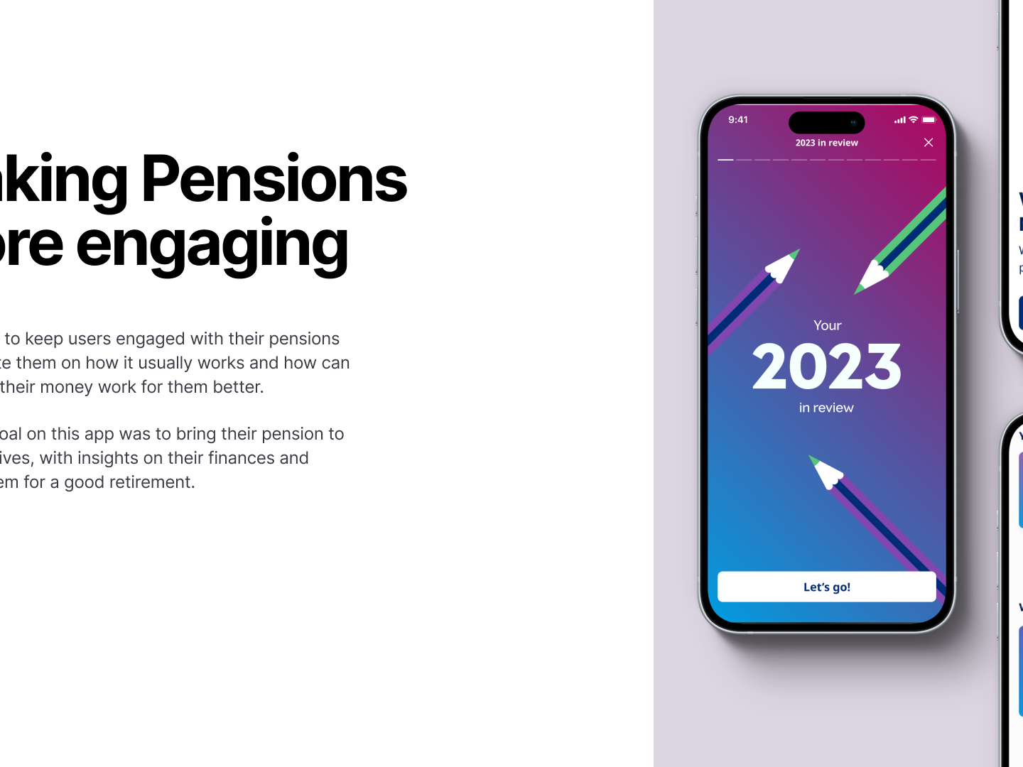
Felipe Soares
Design
2025
The app was rolled over to a few of the companies using Mercer, with growing numbers every day. At each iteration we improve how much the users are returning to the app and exploring the functionalities the app...
View project
2025
Really interesting how a few automations on a Saving Account can make it more interesting and work better. The focus here was to find how people can make savings more fun, personalising and automating their...
View project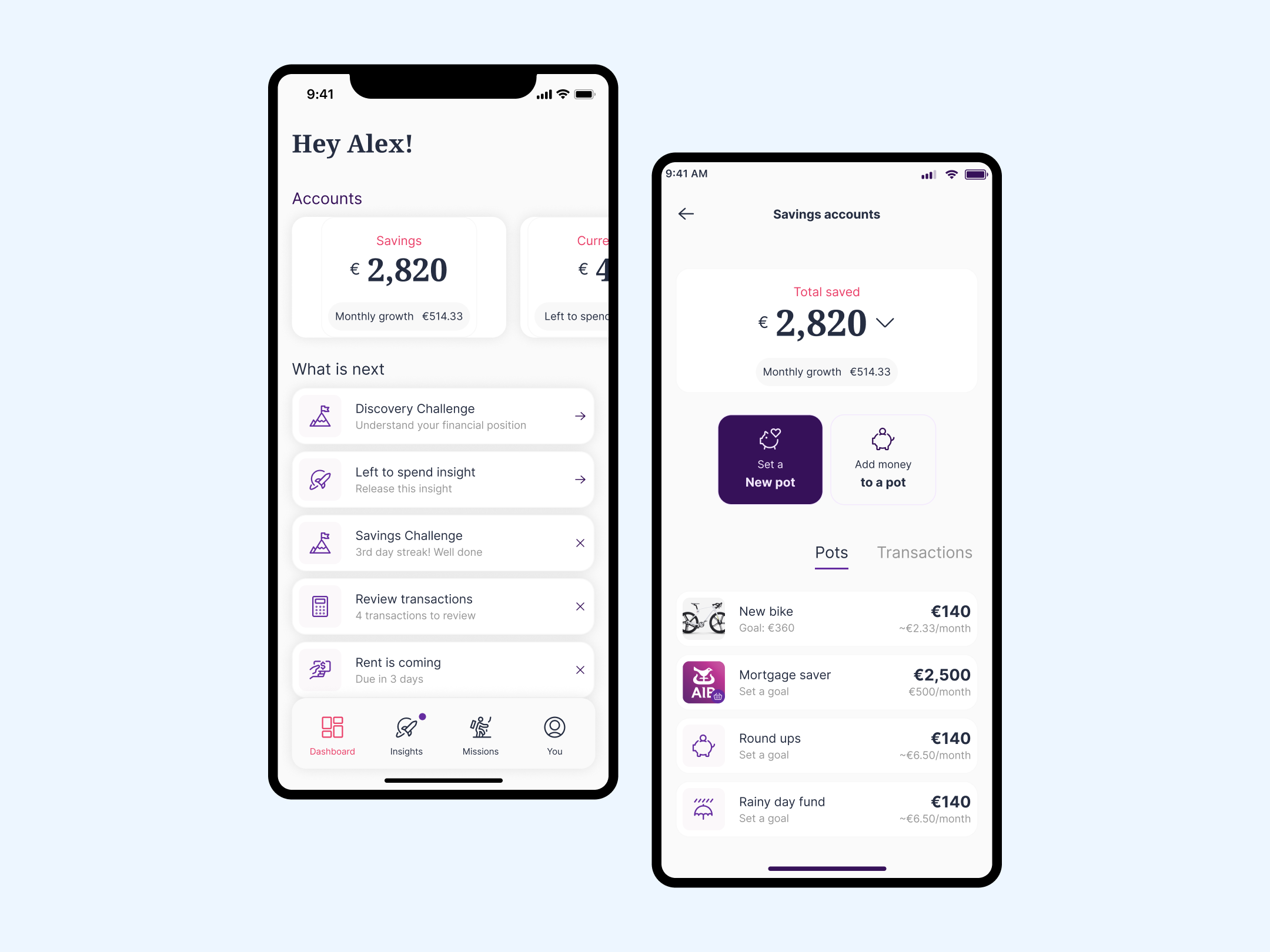
2025
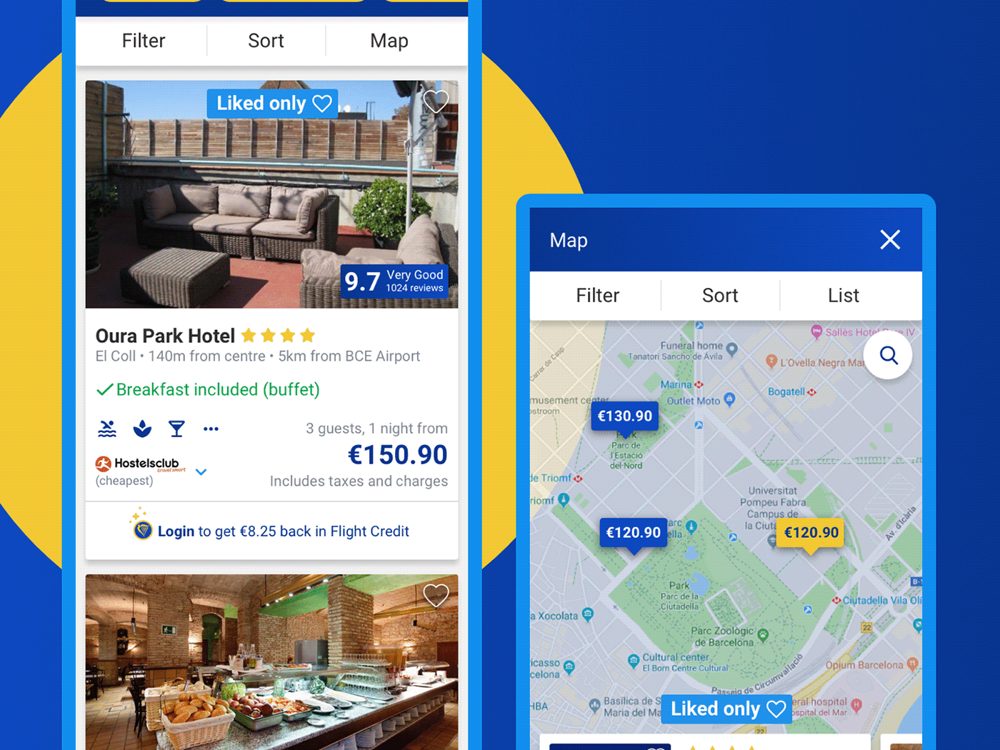
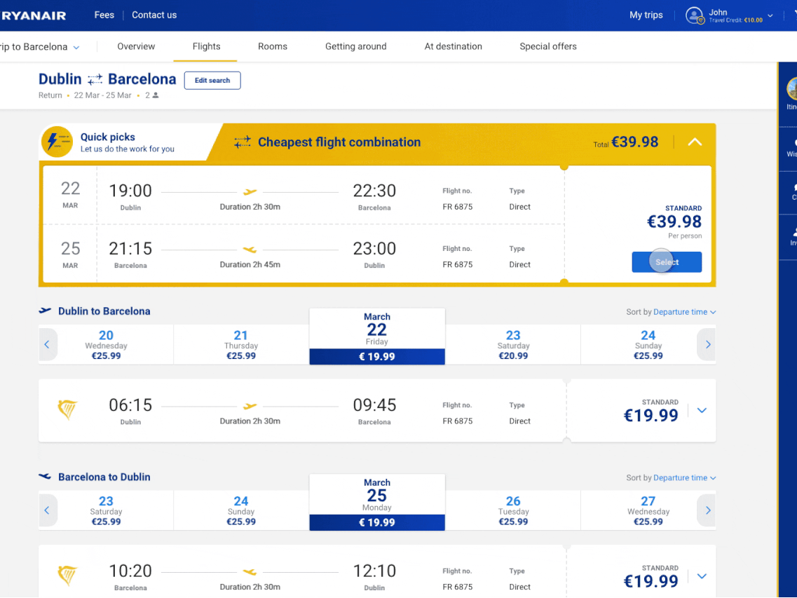
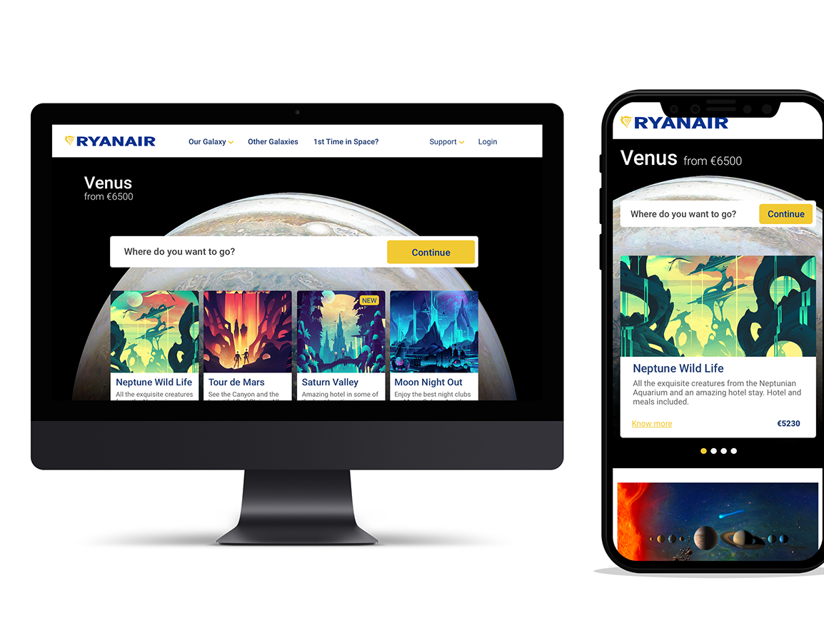
This white label version allowed us to explore and test how open banking could potentially work and evolve over time. On the Dashboard you could take the Discovery Challenge to be ready to get advice or add...
View project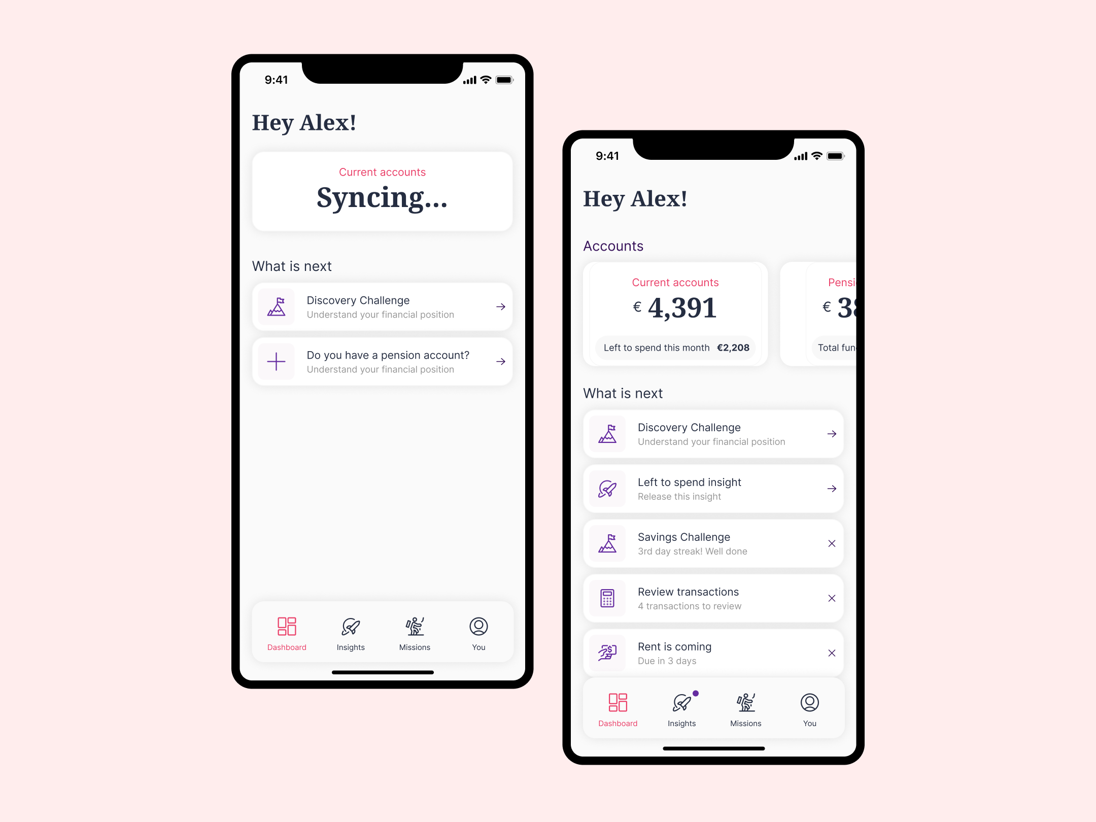
2022
1st exploration of the Dimply Admin. Ver time we completely changed the way this works to add more functionality and better manage all the different possibilities the platform can deliver. This exploration was...
View project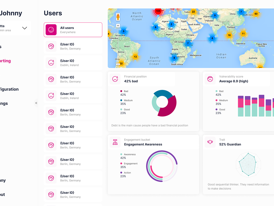
2022
Dimply The intelligent experience and engagement platform for financial enterprises. (Preview)
View project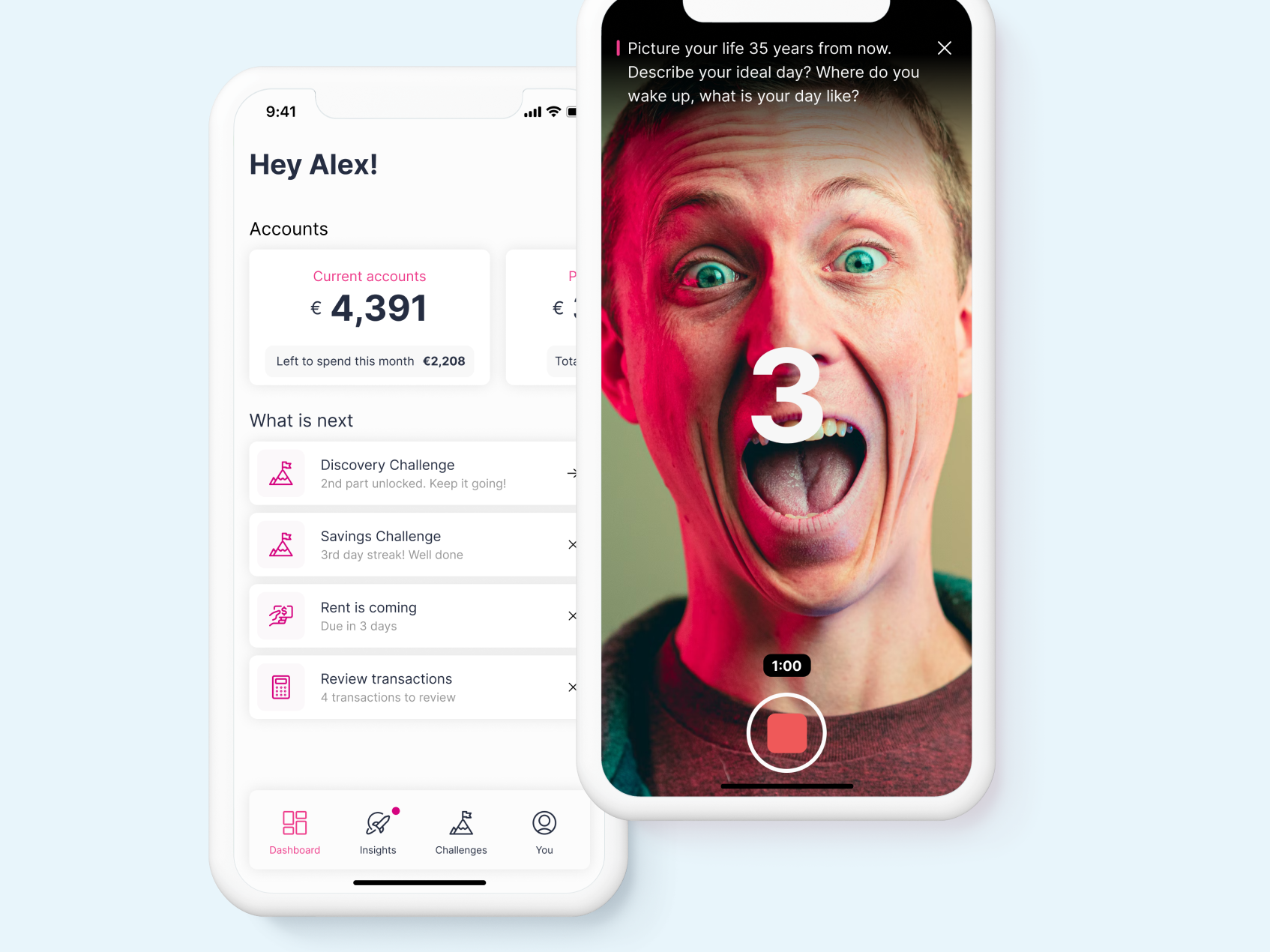
2021
The main idea here was to explore the idea of gmail to work. Usually used on desktop, it can get cluttered with too much information on the screen and improve the integration among Google products to make the...
View project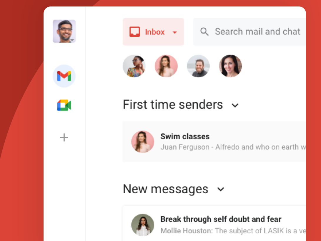
2020
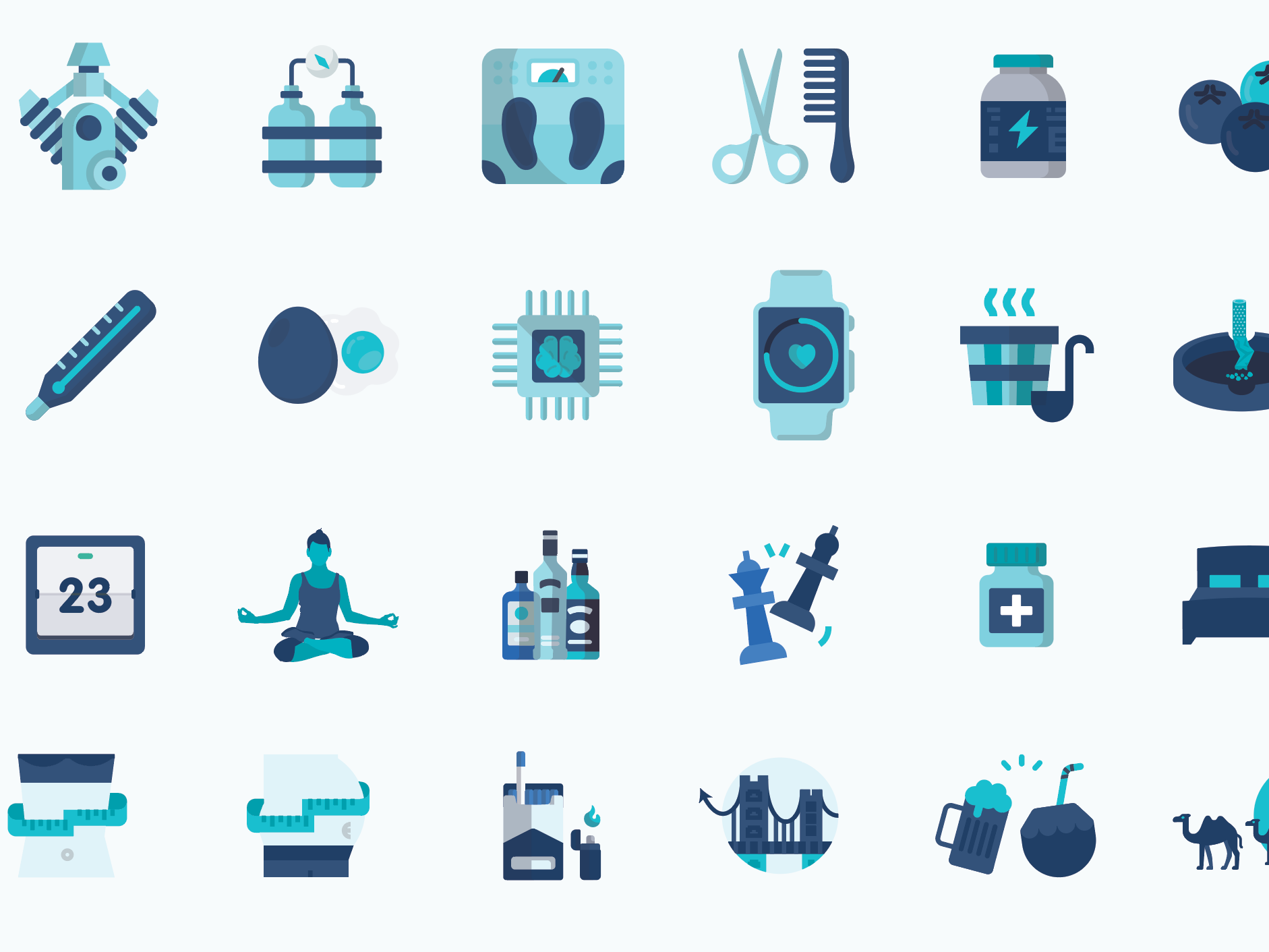
Apple Health Small assessment to improve their DAU. This is a work in progress.
View project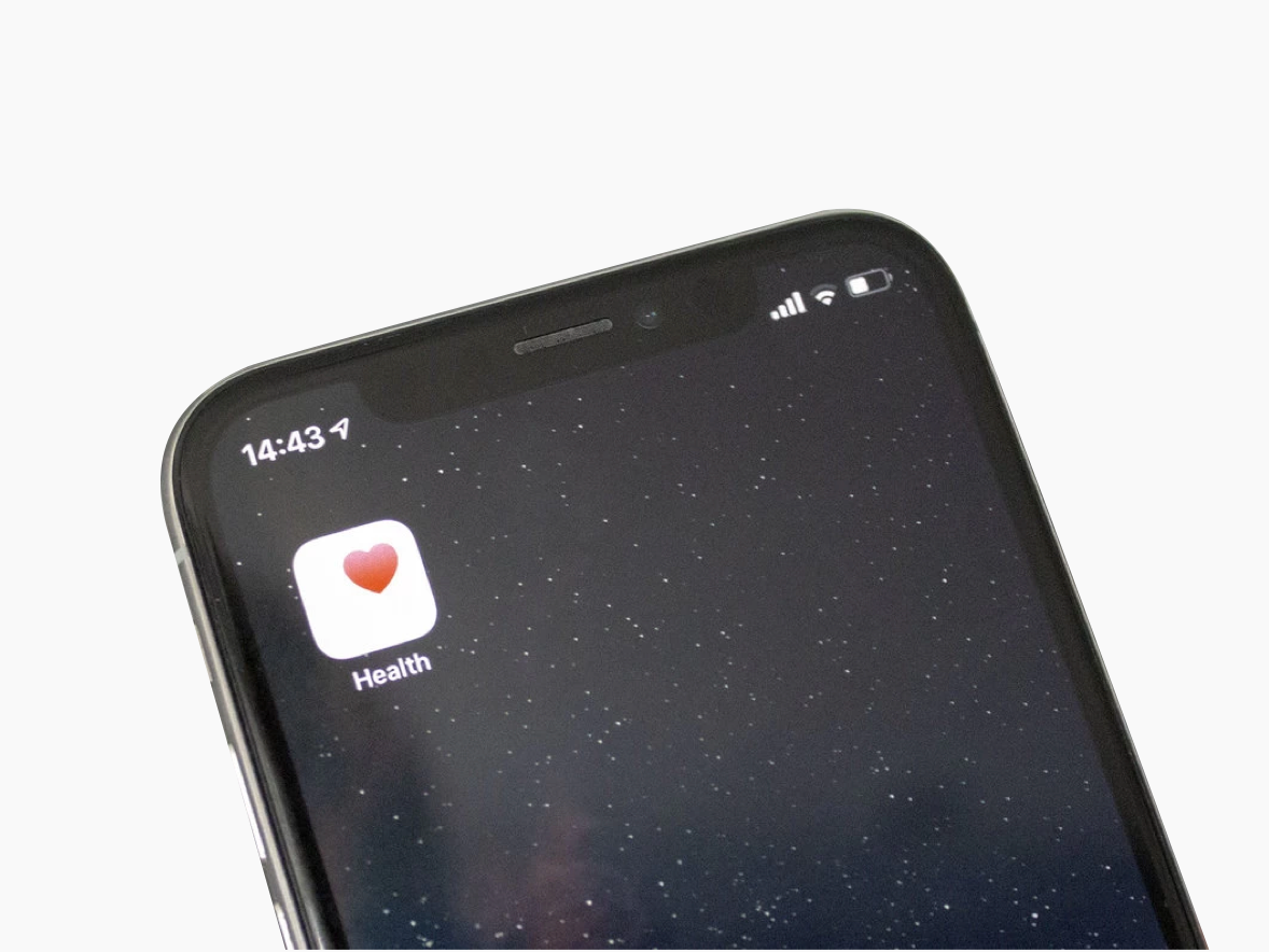
2018
Small animations that were used in videos and online to explain and illustrate a few functionalities and benefits from our app.
View project
2018
SCREEN MOCKUP (ref) My first impression is that is a lot going on on this screen, and I tried to remove all the extra noise (including a small redesign of the nav bar, without the small resizing). I gave more...
View project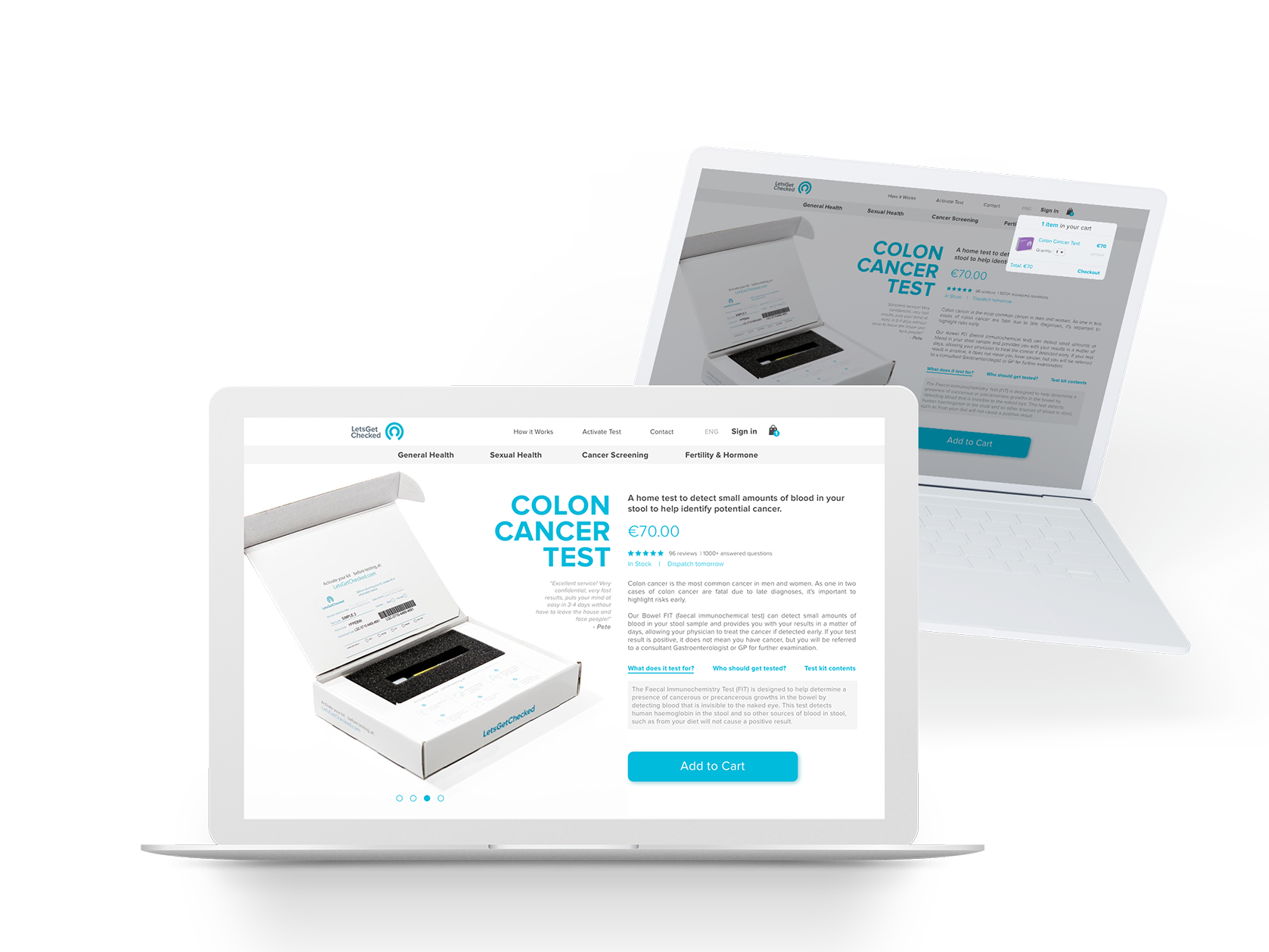
2018
Illustration from this genius: https://www.behance.net/gallery/47545125/Plato-Explanation-video Sensitive details black taped. Internal mockup for a Patient Version of our app. It gives the patient easy access...
View project
2018
A/B Testing First round of A/B testing using Unbounce to manage the process and improve conversion using keyword targeted landing pages. A version was done for all Sexual Health tests and another to show all...
View project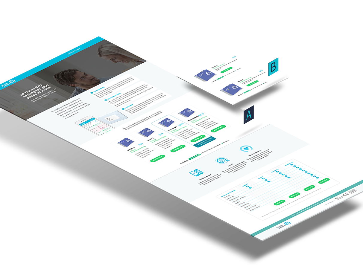
2018
This always evolving document was done to help LetsGetChecked to help with the installation and usage of their brand new API. It includes graphs and diagrams and how to install and use their code calls, with...
View project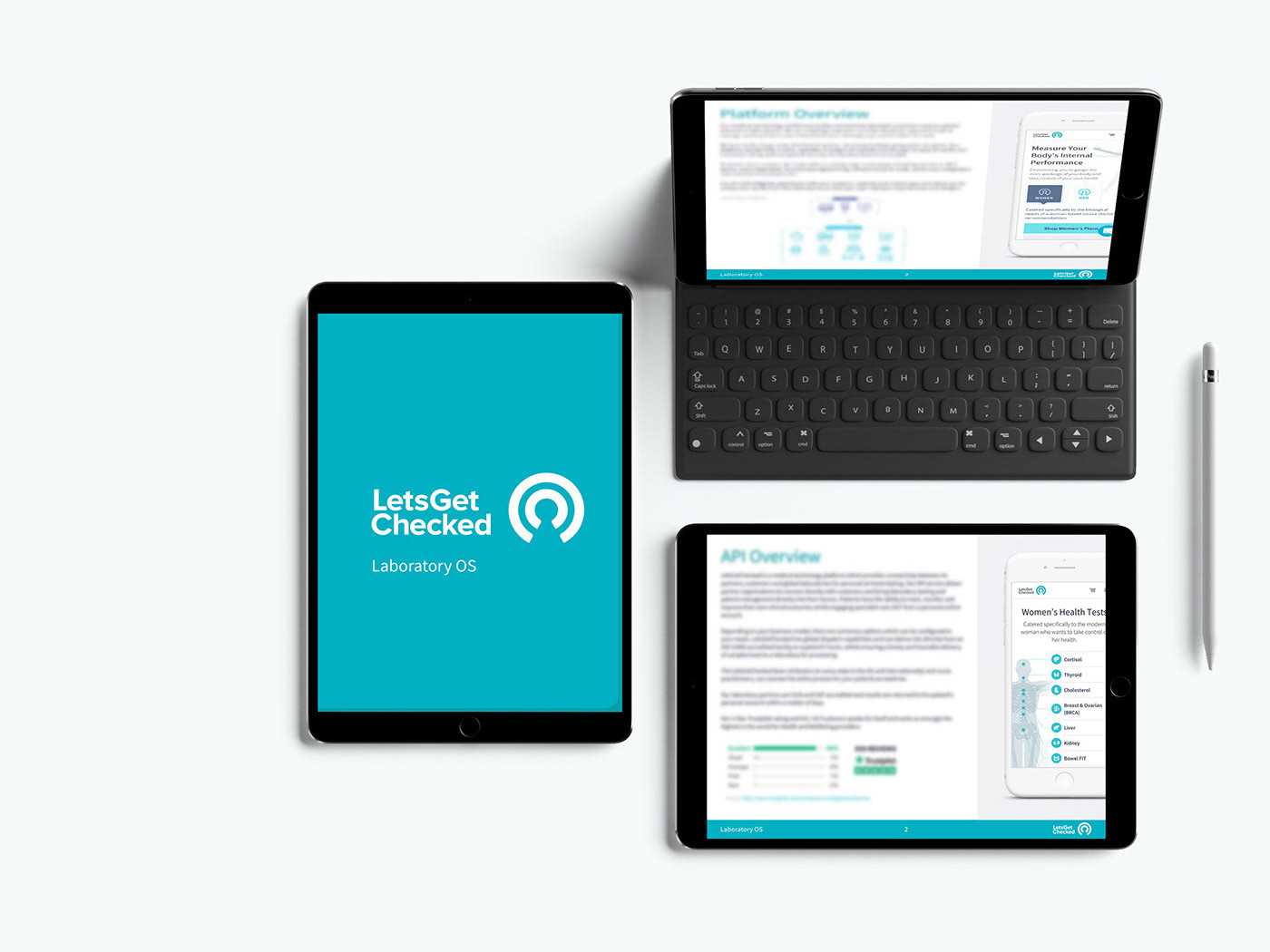
2018
Illustration Support Series of illustrations done to show specific body parts and how they're structured. This image should support our tests, and serving as support for the text explaining the biomarkers...
View project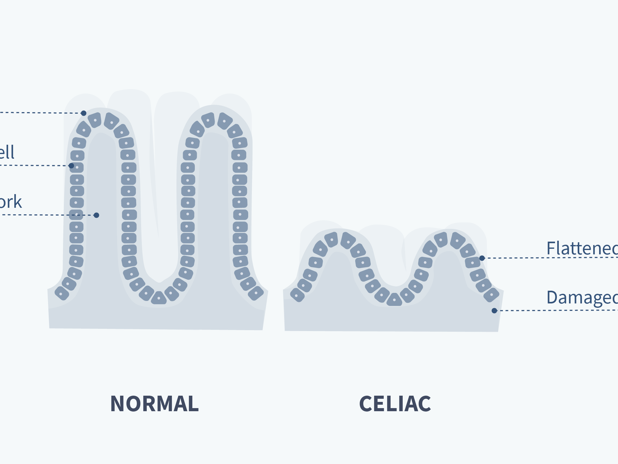
2018
This project was an exercise to see possibilities to our shopping cart and checkout process. The idea was to provide quick access to the customer's data (such as delivery information, payment details, etc), and...
View project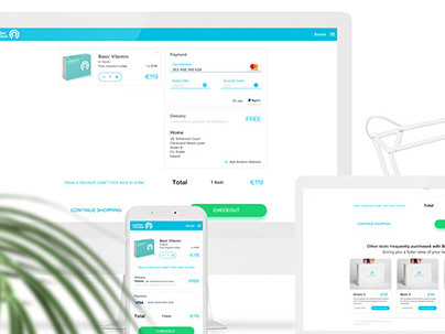
2018
This Dashboard was a test for the Admin side of our Patient Portal. The aim was to understand how to deal with all the information of the Portal and make it friendlier and easy to use.
View project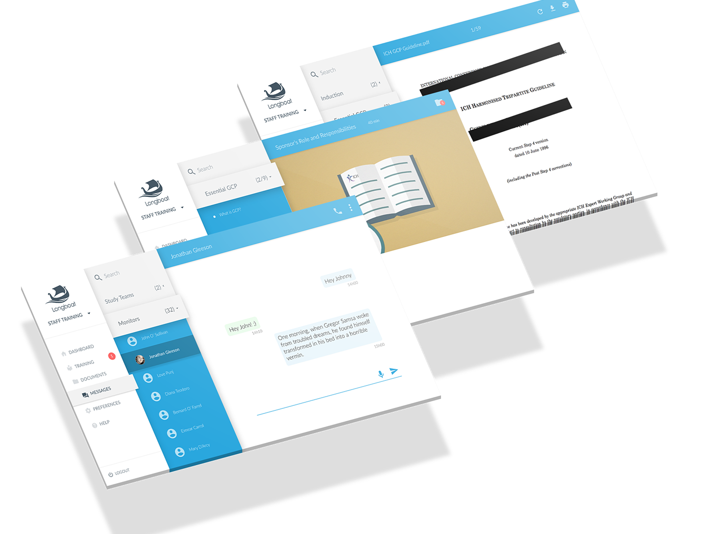
2018
Some iterations to check for usability and workflow of the Longboat's Admin Dashboard.
View project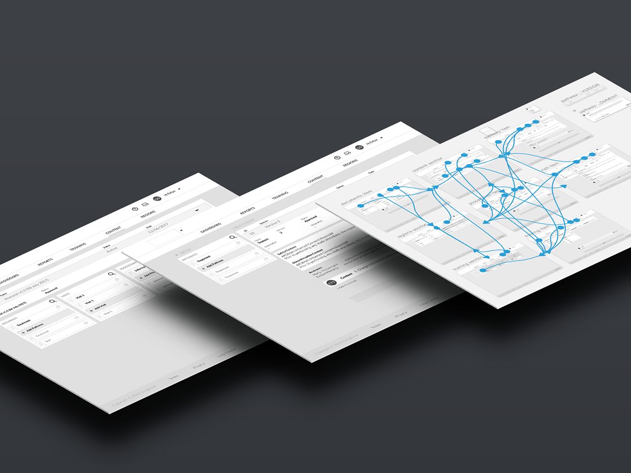
2016
This is the conclusion work of the post graduation course in Branding and Brand Management in IED. The study object, Vila Alpha School, works with kindergarten and elementary school. With the objective to...
View project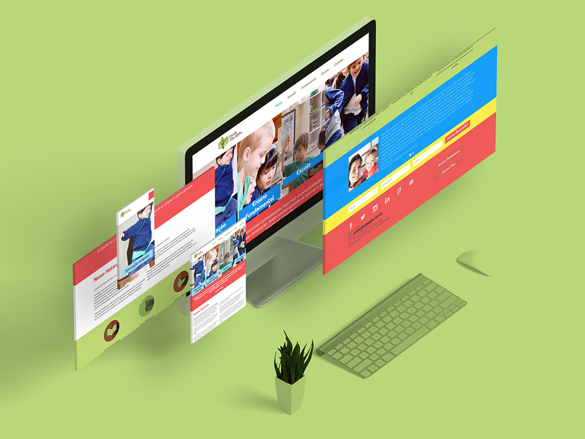
2018
Icons created for the Longboat's platform. After created, I imported into Glyphsapp to fix the anchors and get rid of the extra points, and created an otf, woff, woff2 font file to be used across the app.
View project2016
Why? The login screen should be clean, and reinforce the presence of TCAS Online in the many countries and cities, always with a good and nice picture from their skyline. We can use some location pins to say...
View project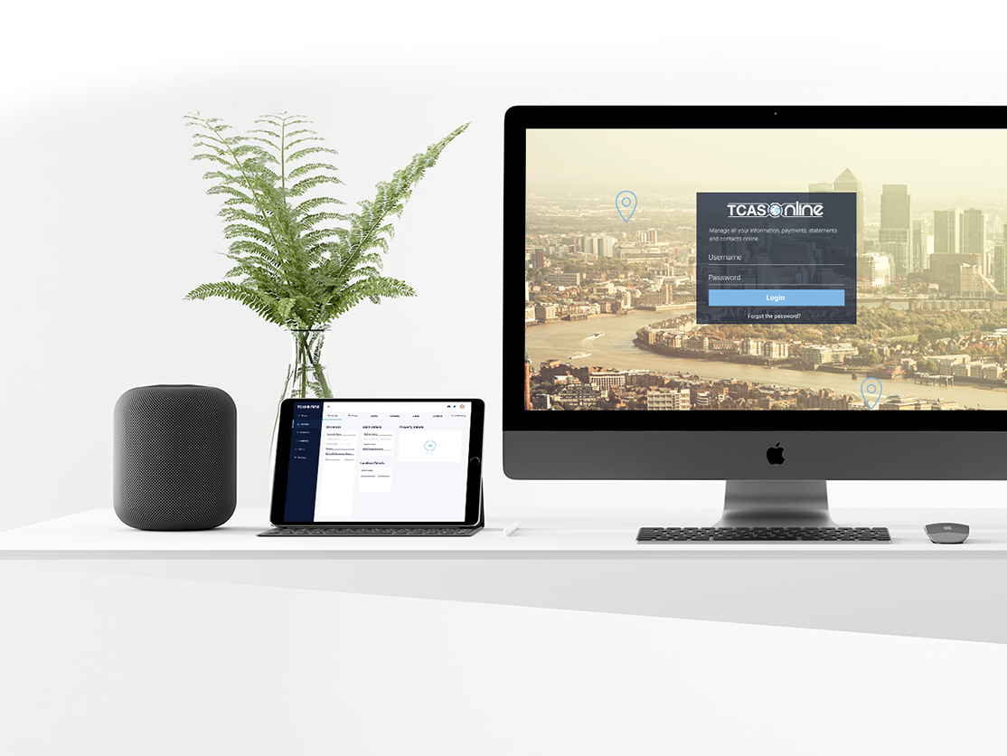
2016
Great musician and personal friend. YOU HAVE TO HEAR: http://fabiocardelli.com.br/
View project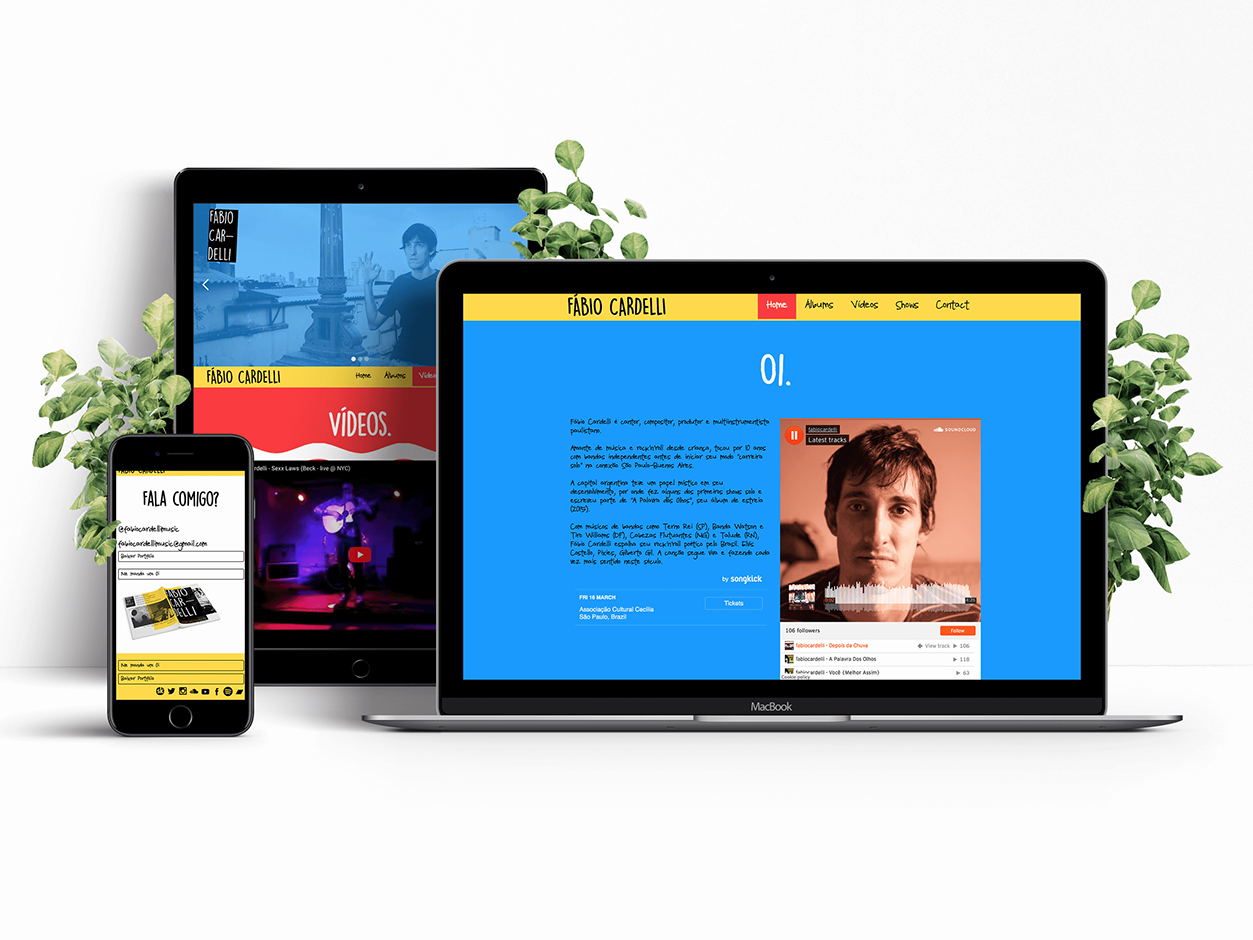
2016
New look, new Life In this project, we had to give a new look and star to build up the brand Agro Ravena. They had just started to sell their products online and felt that was the right time to refresh the...
View project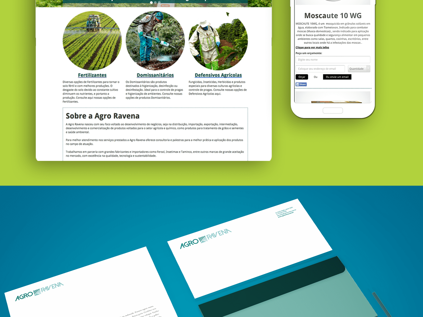

About
Felipe is a product designer based in Dublin, building interfaces across fintech, travel, healthcare, and brand work. This portfolio brings together case studies, experiments, and interface explorations from the last several years.
The work tends to focus on making complex products easier to navigate, easier to trust, and more engaging to use over time.
Contact